Theme – Vanity.
The Vanity theme was chosen to celebrate the joy of indulgence and self-care during the holiday season. With festivities in full swing, it’s a time of dressing up, pampering, and embracing beauty in all its forms. Vanity isn’t just about appearance—it’s about feeling good, taking a moment for yourself, and elevating everyday rituals into something special.
I initially explored the idea of blending the Vanity theme with classic Christmas elements, aiming to highlight indulgence and festive self-care. However, I soon realized that traditional holiday graphics didn’t align with the essence of vanity.
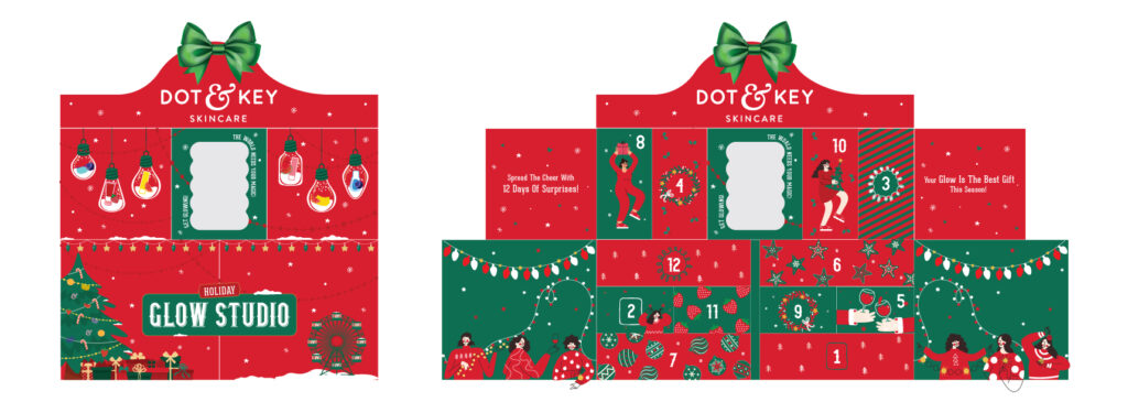
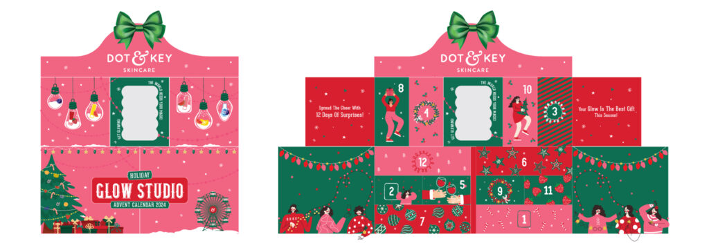
To create a more premium and timeless feel, I shifted my inspiration towards Victorian dressers—symbols of elegance, beauty, and personal indulgence.
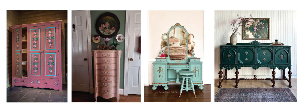
This approach allowed me to craft a design that felt sophisticated, luxurious, and rooted in the ritual of self-care while still capturing the magic of the season and the essence of the brand.
To bring the Vanity theme to life while maintaining a strong brand identity, I started by incorporating a key element from Dot & Key’s branding—the “&” symbol from the logo. I amplified this motif across the design, using it as a unifying visual element that subtly reinforced brand recall while adding a touch of elegance.
Since fruits are synonymous with Dot & Key’s skincare formulations, I integrated them into the patterns, ensuring they complemented the Victorian-inspired aesthetic. Instead of using them in their usual playful style, I reimagined them with intricate detailing, enhancing the luxurious and timeless feel of the design.
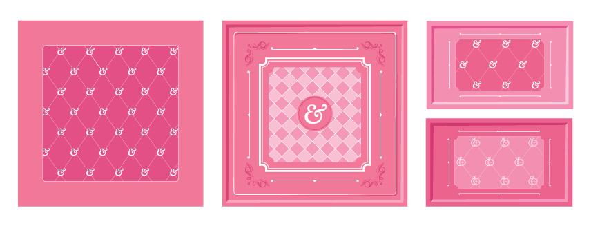

For the color palette, I chose a soft yet rich pink, moving away from traditional holiday reds and greens. This decision was driven by the desire to maintain brand consistency while giving the design a modern, feminine, and indulgent appeal. The pink hue added warmth, sophistication, and a sense of personal luxury—perfectly aligning with the self-care and vanity theme.
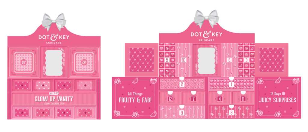
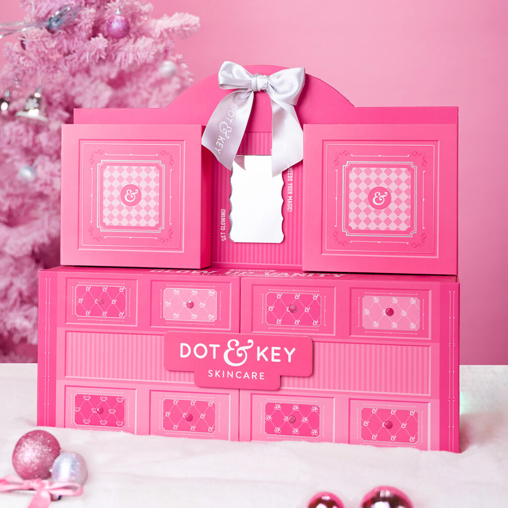

Here’s a glimpse of me designing the advent calendar 2024 🙂
