Reimagining brand design — A 3-year journey of transforming Dot & Key’s visual language into a cohesive, modern, and joyful brand experience. As the lead designer, I led the brand through a strategic visual evolution, refining every touchpoint from typography to packaging to photoshoots and everything in between.
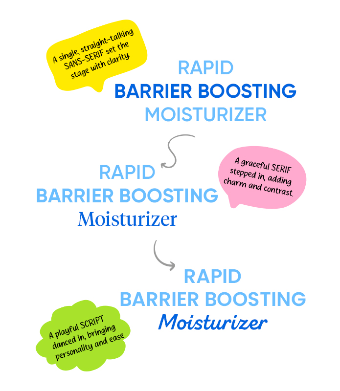
The Font Evolution:
From serious sans-serif to a script with sass—watch the typefaces glow up!
Subtle shifts, bold impact – refining the brand’s voice through type.
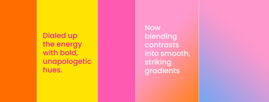
The Colour Glow-Up:
From Meh to Magic.
Started subtle, turned bold — now it’s all about seamless, show-stealing gradients.
Photoshoots That Grew Up with Gen Z Energy.
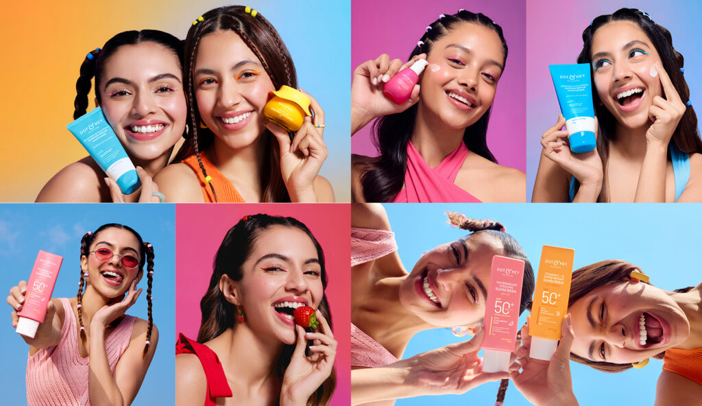
What began with clean skin, soft pastels, and subtle styling has shifted to match Gen Z’s fearless spirit—embracing colour, graphic liners, and experimental hair to create visuals as dynamic as the audience they speak to
2022:
Clean, soft pastels with subtle styling, fresh no-makeup looks, and crisp white outfits—letting the products take center stage.
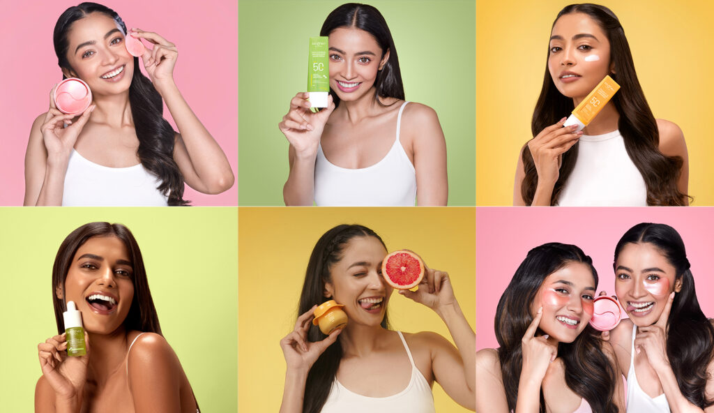
2023 – Brighter backgrounds, tone-on-tone outfits, fun expressions, and playful pops of makeup to dial up the energy.
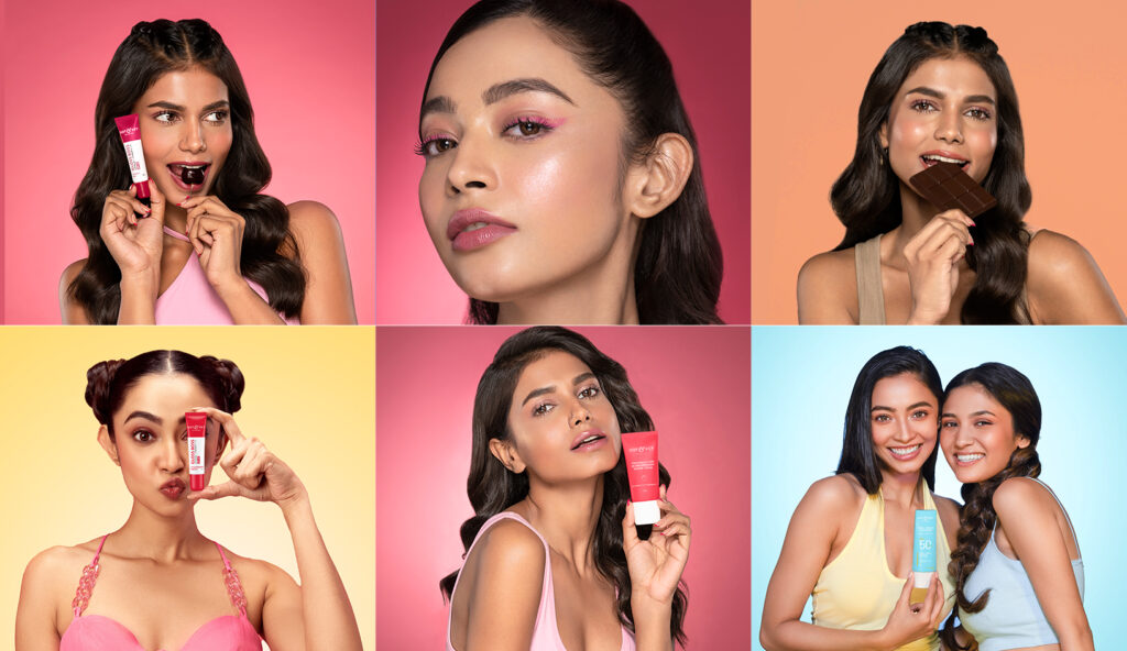
2024 – All-out experimental vibes with bold liners, quirky hairdos, fun co-ords, vibrant products, and dreamy gradient backdrops.
Design that grew with the brand:
From clear communication to playful storytelling, the creatives began to reflect the brand’s vibrant, human side.
2022:
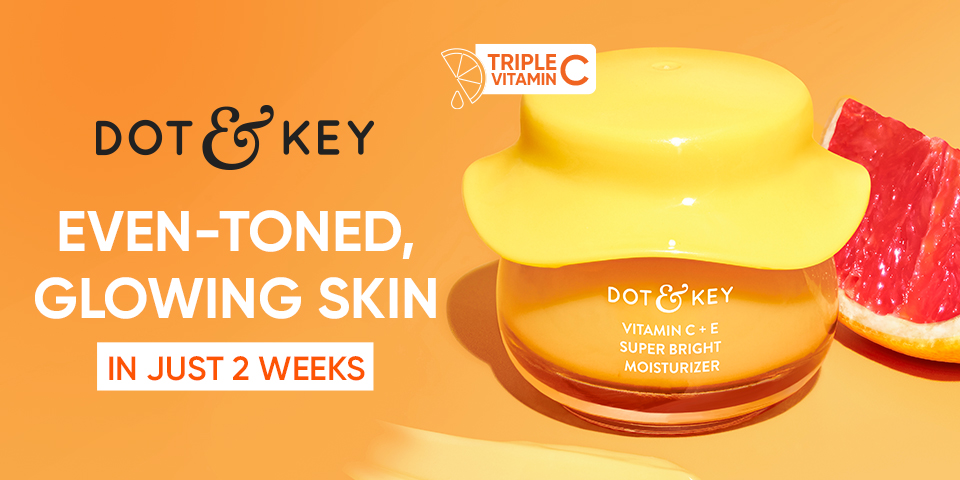
A functional and straightforward approach, with bold typography and minimal graphic play focused on clear communication.
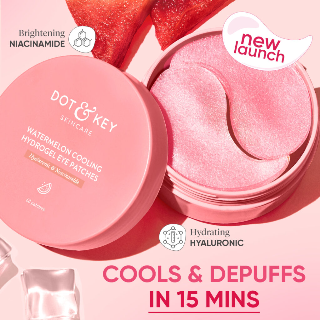
2023:
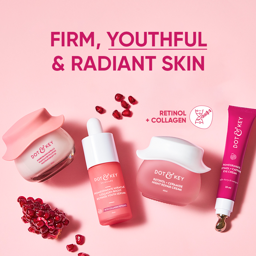
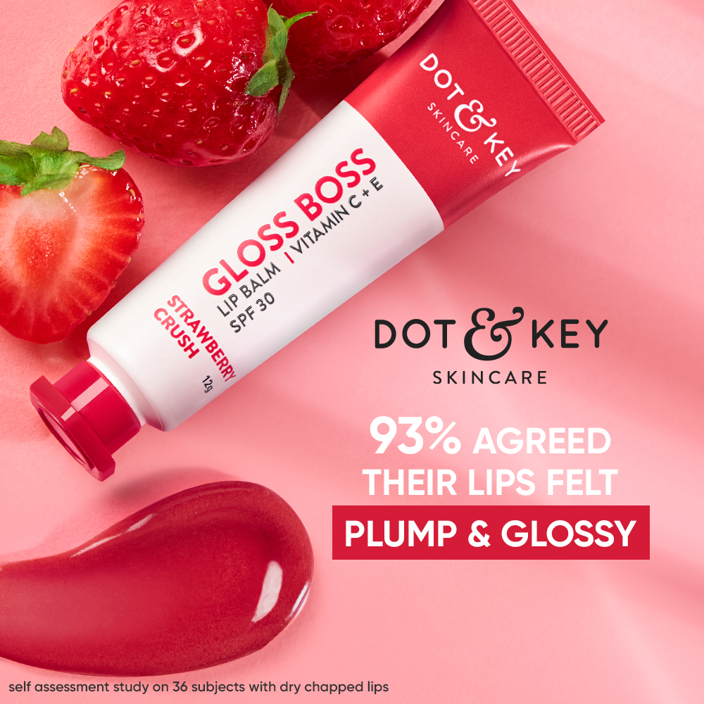
A step towards more impact by enhancing text hierarchy and emphasis, creating stronger focus on key benefits while refining the layout.
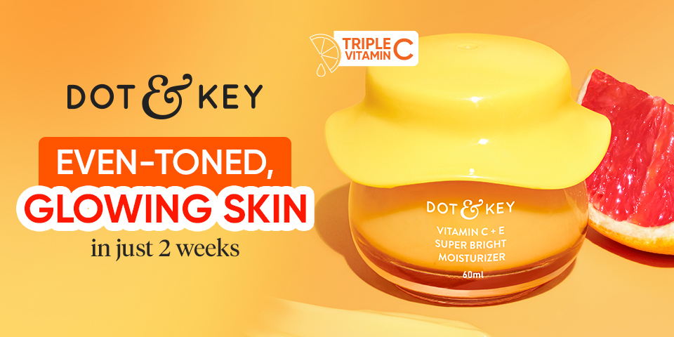
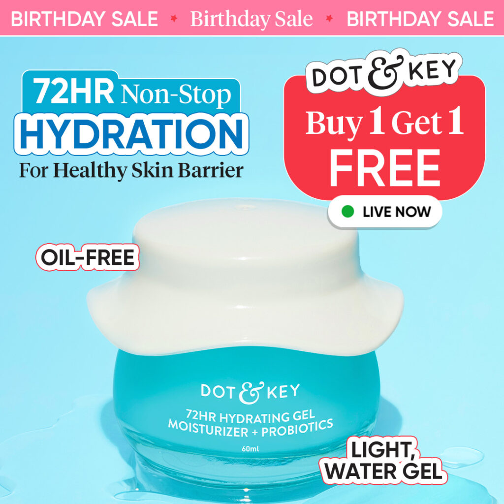
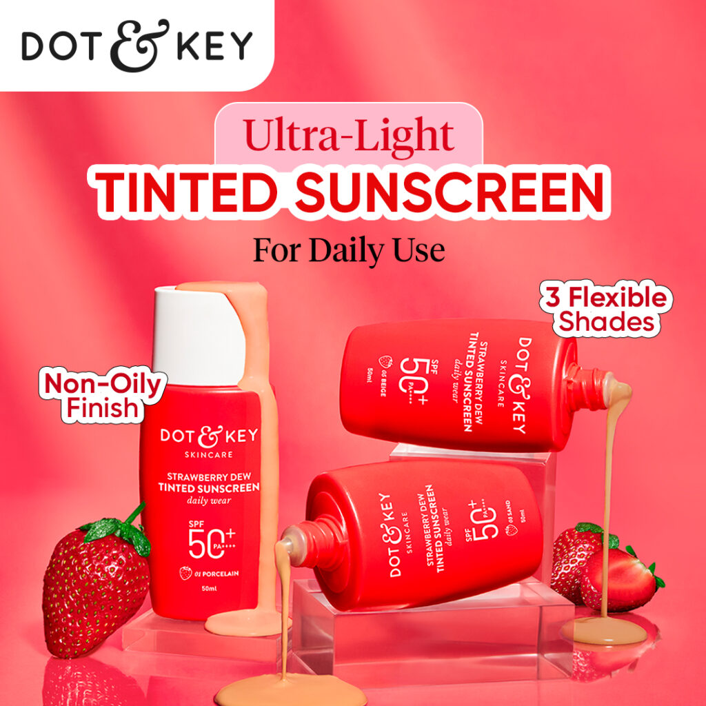
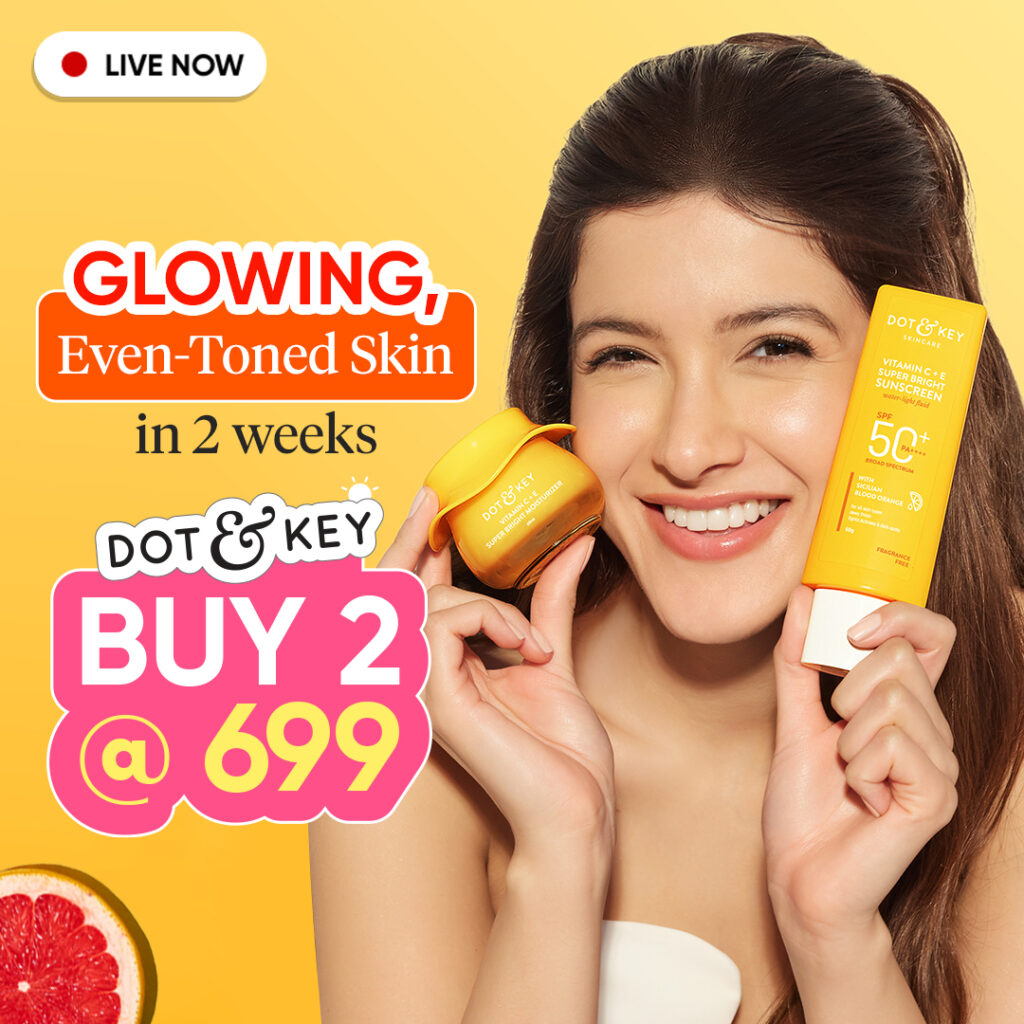
2024:
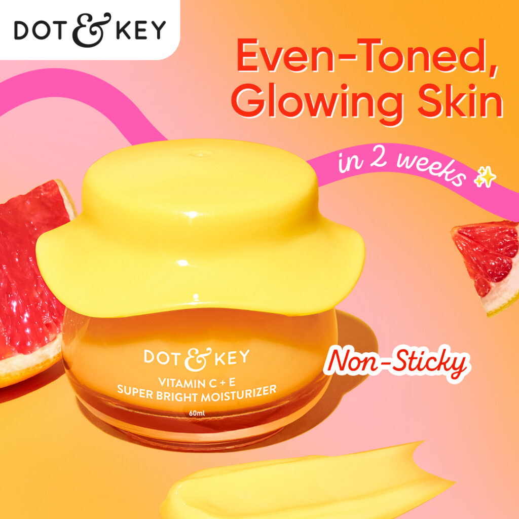
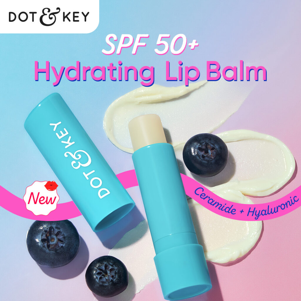
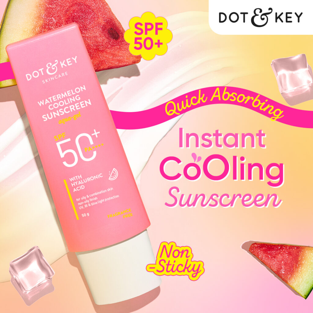
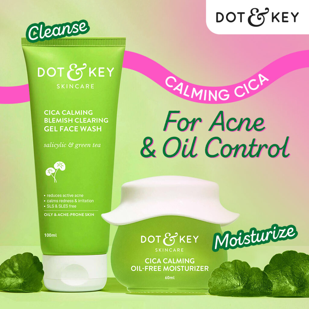
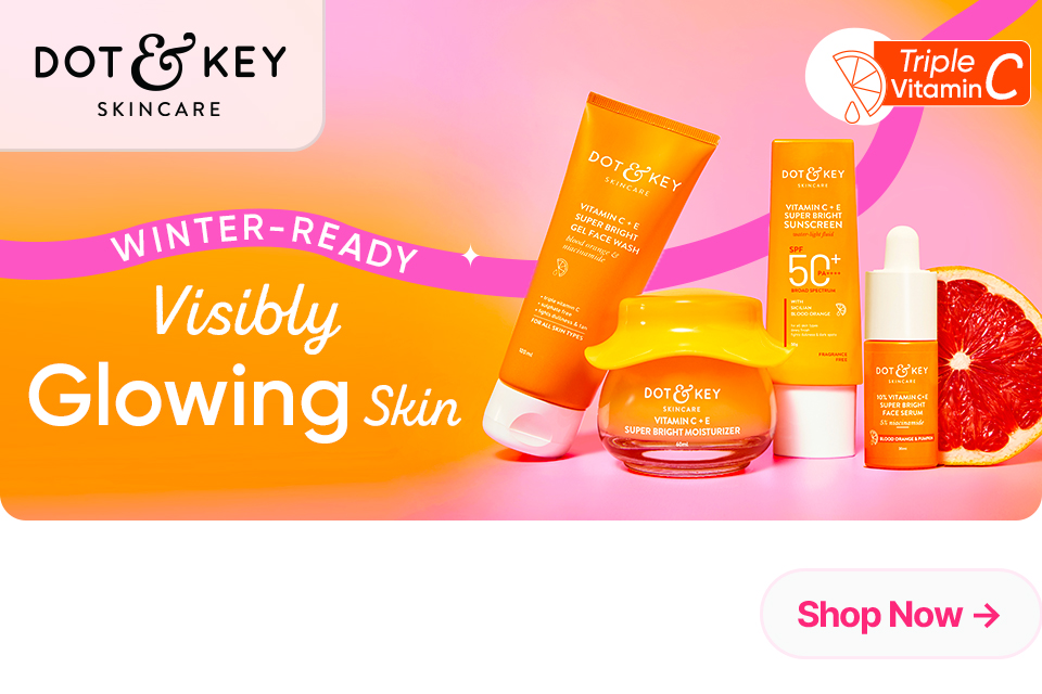
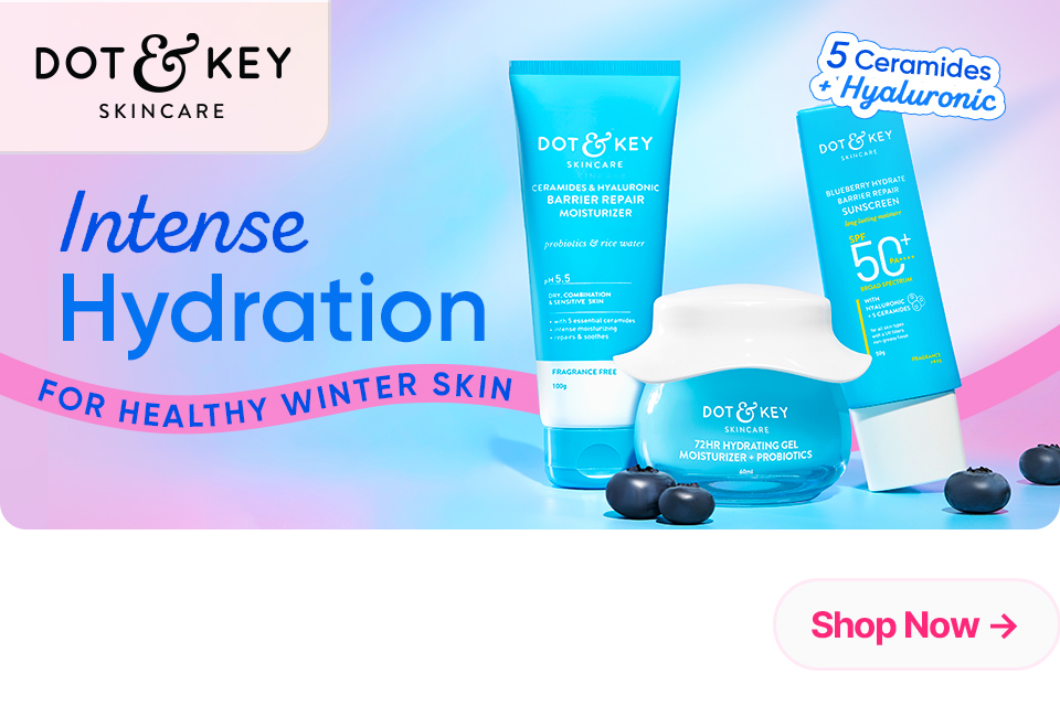
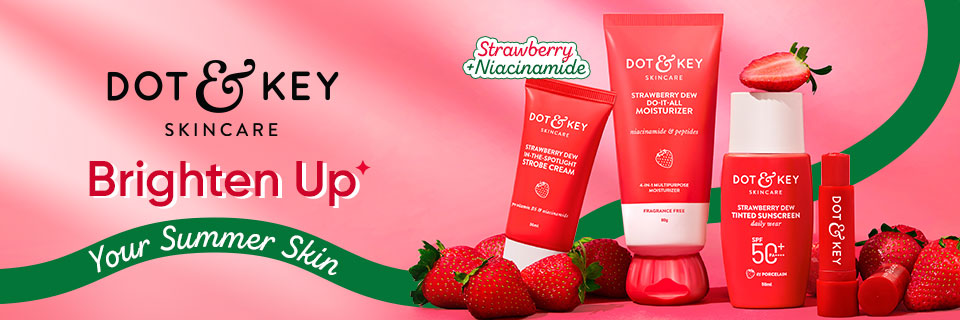
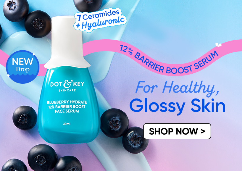
A fully evolved, playful, and dynamic design with fluid shapes, lifestyle cues, and added character — bringing energy, warmth, and a more humanized brand feel.
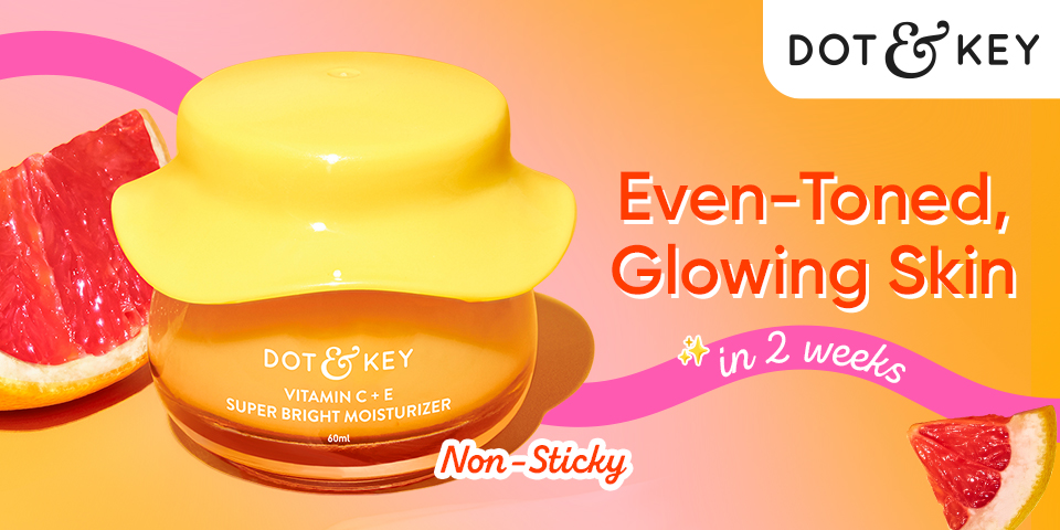
Bringing It All Together.
As Dot & Key grew, so did the brand’s audience — from skincare explorers to informed enthusiasts.
To keep up, the design language was transformed into something more refined, cohesive, and memorable, ensuring the brand felt as evolved as the people who loved it.
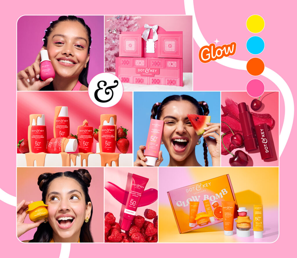
Design Language in Action
Fin.