A mobile-first UI created for Dot & Key’s biggest summer sale — focused on visual freshness, playful brand tone, and easy navigation to boost conversion during the event.
Objective:
Highlight a limited-period sale with an engaging and memorable theme.
Maintain brand consistency while adding a playful twist.
Ensure the interface is mobile-first and user-friendly.
Prioritize quick add-to-cart flow and product visibility.
Scroll-friendly design with offer repetition for high visibility.
Sticky cart buttons for seamless shopping.
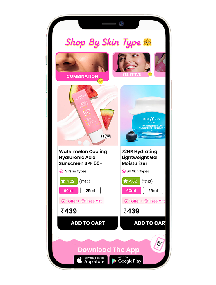
Categorized layout for products (new arrivals, combos, by concern).
Optimized for quick browsing + impulse purchases.
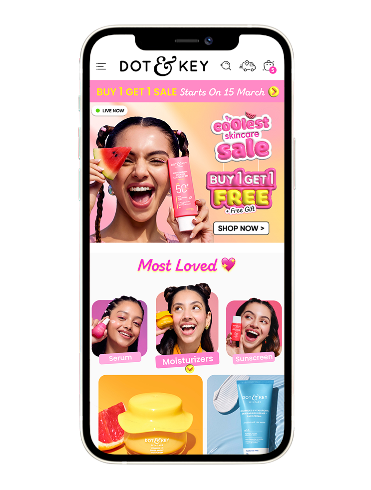
🎯 Hero Banner:
– High-energy visuals to spark excitement.
– Offer-led creative to drive urgency.
– Visual hierarchy with model face to create instant recall.
– Designed to maximize engagement at first glance by leading with urgency and value.
– Bold CTA immediately visible as the page loads.
– Followed by “Most Loved” section to build trust.
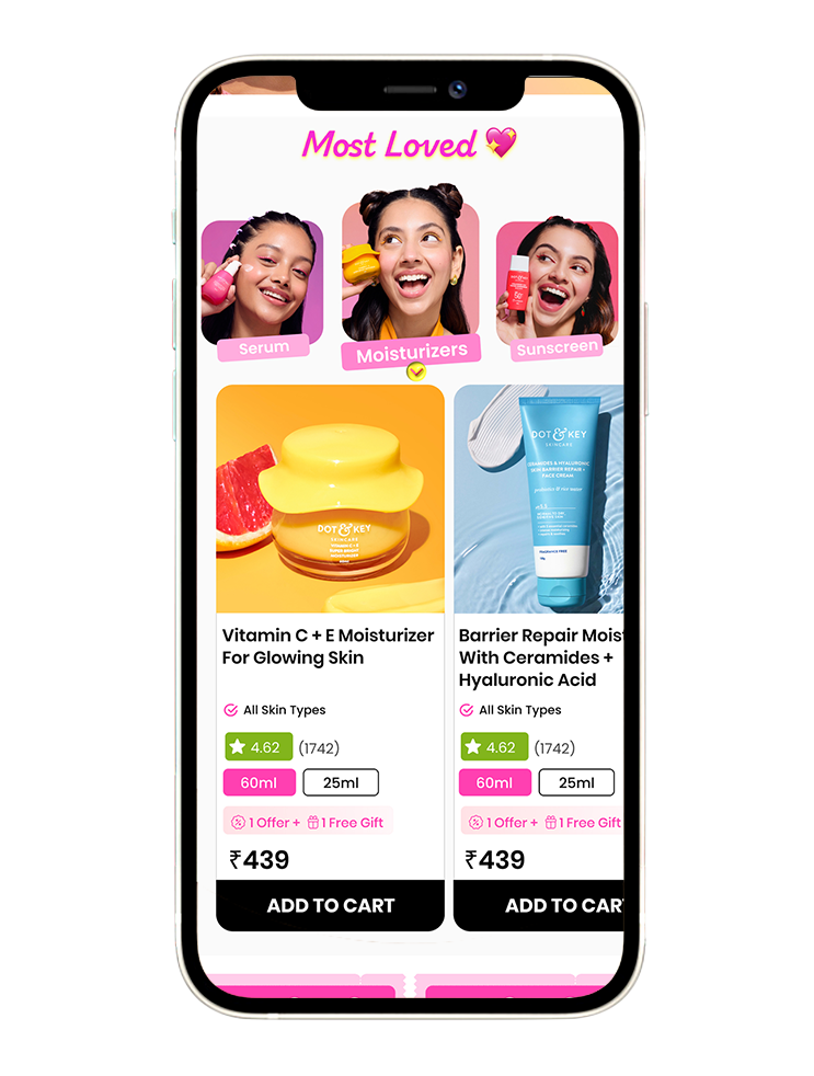
💖 Most Loved Section:
– Directs users to top-selling Dot & Key products.
– Acts as a quick-start guide for first-time users.
– Horizontal Scroll format encourages discovery by highlighting product categories.
– Showcase top-rated products to reduce decision fatigue.
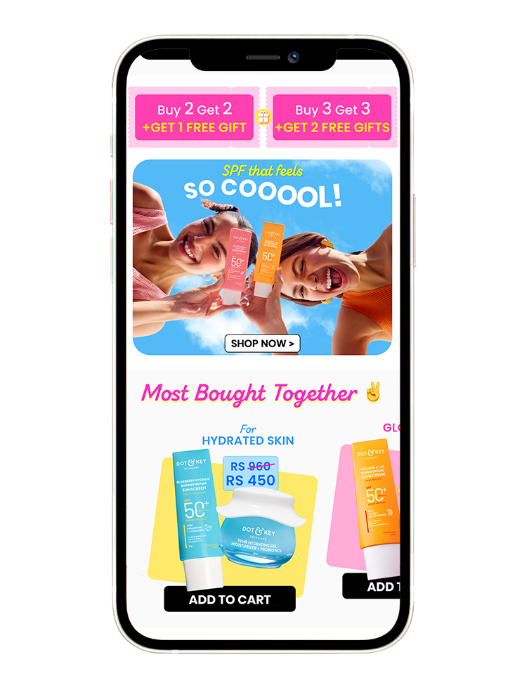
– High-Visibility Offer Strip with vibrant colors and ticket-style UI to instantly grab attention and drive urgency.
– A fresh blue sky background sunscreen banner visually breaks the pink palette above, creating a natural scroll pause.
– “Shop Now” button placed directly under the banner for immediate action, using high-contrast for visibility.
👯Frequently Bought Together – Cross-Selling Made delightful:
– An attempt to increase the average order value by surfacing data-driven pairings.
– Smart use of duos makes decision-making for the customers easier and fun.
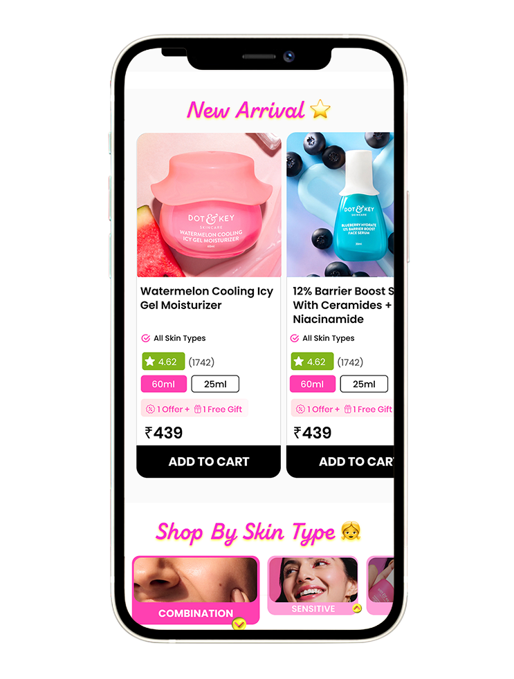
🌟 New Arrivals:
– Placed strategically mid-scroll to ensure new products catch the eye during casual browsing.
– Close-up imagery instantly communicates skin types, making the section scannable and self-explanatory.